
Okay, I’m airing my closet and giving you a sneak peek. Top marks to anyone who can guess the sorting order. You can also take the following as a recommendation list… well, apart from ‘Sally’s Spa’ – addictive as hell, but I’m not quite sure it’ll be up your alley. Similarly, if you see something that I don’t have, and must, please let me know and I’ll add it to the assortment.
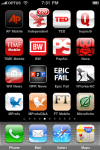
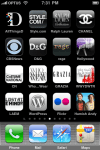
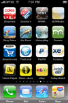
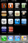
In all seriousness though, for anyone wanting a nice summary of what is available media or content wise, check out images 3-5 (L-R, top to bottom) as I’ve pretty much downloaded everything ‘official’ that is out there to date.


Kate, I haven’t had a chance to digest the apps yet but haveyou sorted these by colour? LOL!
Haha – maybe. ;-)
That’s a lot of apps!
Wow .. I feel so much better about my 7 pages of apps all of a sudden! Are they in any particlar order? Or do you just let the App Store fill up screen after screen?
I think there’s an important question here: how does everyone group their apps?
Me:
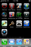
Page 1: Most commonly used. You can get back to page one with one click of the home key.
Page 2: Navigation and Entertainment: TV, Movies, eBooks
Page 3: Media: Cameras, Image editors, uploaders, Radio, YouTube, Shazam
Page 4: Games
Page 5: Things that generate noise/music
Page 6: Other things I haven’t put elsewhere
Page 7: Apple Apps I can’t remove, but don’t use (Stock, Weather, iTunes, Voice Rec.)
My favorite thing about looking at apps, grouped by page, is the similarities in colour schemes of the icons. For instance on your ‘Fashion’ page, there is a distinct black, white and grey scheme. On my phone, social apps always seem to resonate blue.
There is one more app you may want to add to your list as a Melbournian, assuming you drink coffee that is – the Melbourne Coffee Review.
MCR is an awesome app .. but needs a lot more reviews.
Though, IIRC, Kate doesn’t touch the stuff. :-D
As for the icon colors, it’s always been a bit of a joke that companies tend to cluster to logo colors based on their industry. Telecommunications are blue and orange. Lifestyle companies are blue and green. Political entities are blue and white (and red, but never predominantly red!) Now it seems that app writers are doing the same clustering!
Rick – you are absolutely correct! Never have and never will. I like to get a natural kick of energy from within. ;-) (With the help of an energy drink every now and again of course.)
Josh – responded here as well: https://katekendall.com/2009/12/09/what-do-my-iphone-apps-say-about-me/img_4010/.
Zac – hope to see you at #socialmelb before year’s end you slacker! You don’t have uni or hangovers as an excuse now.
Rick- I find i collect apps (your page 7) that I have paid for but don’t use, cant seem to throw them away! Good point about icon colours, Youtube seems to be the odd one out. The MCR app is about to have 400 more cafe’s inserted and the new photos are being snapped as we speak and reviews compiled.
Kate – Sorry for the double post :) well if hot chocolate is on the cards, there are 5 of the great places hidden in the app. Hope to see you at my first #socialmelb soon