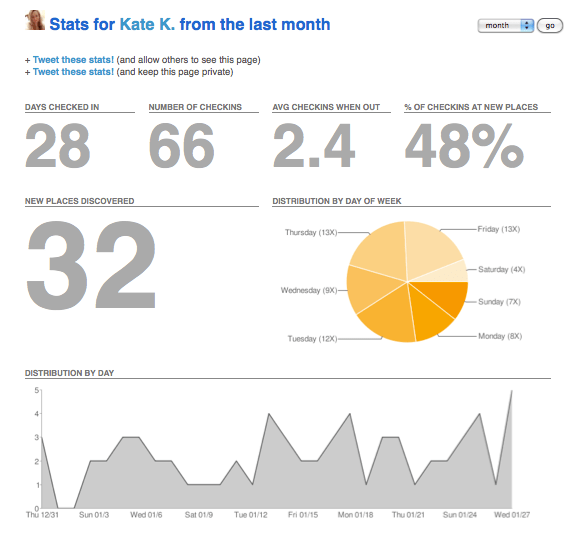
Foursquare has some great stats associate with each user account that summarise your check-ins within a certain time frame. The data curation is inspired by the Nicholas Felton “school of design” (his personal annual reports are worth the read). Anyway, I’ve included my info below as an example (click each image for a higher resolution). The ability to display the data accrued (in this case from the past month) provides a nice insight and I think that more social platforms should offer the same functionality. Obviously the level and breadth of sophistication of the analysis isn’t as nifty as what external providers might provide, but it is certainly a useful tool for the average user.
I’m http://foursquare.com/user/katekendall on the platform, although I’m currently only using it for people I’ve met face-to-face a few times or know well. Promoting your location is something that I feel is incredibly intimate and as a result involves a large amount of shared trust in any relationship. I’m placing it above Facebook in terms of tightness of connections, but that’s probably the cynical ex-journo in me used to running from PRs! That said, I don’t mind sharing my stats here as I use Foursquare mostly during the week when I’m out and about in South Melbourne around the Niche offices, so it’s a no brainer to put two and two together and assume I would be nearby.
It’s quite ironic though, because even if someone was in the area, I probably wouldn’t have the chance to drop what I was doing for an impromptu meetup! (I prefer to schedule industry-related meetups!)
What do your infographics look like?


One thought on “My Foursquare infographics”
Comments are closed.